Sunday, 20 December 2015

Coming up with a name...?

I've been struggling to come up with a title for my animation. Therefore I sought some tips from the internet.

http://www.chrisjonesblog.com/2011/07/top-ten-tips-for-titling-your-movie.html

  1. The shorter the better.
  2. The title should hint at the genre of the film. Do this well and the second question people usually ask (what’s the genre?) is answered implicitly.
  3. The title is a sales tool designed to get people to read the script, rent the film or ask for more information. It is NOT an artistic statement (think more craft than art).
  4. More often than not, your title will be accompanied by a short pitch or key artwork. This should all work in harmony and feel like a component part of a whole and well rounded concept.
  5. You will NEVER be 100% happy with the title. It always feels like a bit of a compromise. And why shouldn’t it? You are reducing 100 pages of story to a single word of phrase.
  6. Once you decide on a title, if a better one comes along, use it. You are NEVER wedded to the title until the film is complete (of course this raises social media and online marketing problems). Ideally get it right up front, but DON’T hold on to a poor title if a new and better one comes along.
  7. Check the titles ‘Goolgeability’ with the Google keyword tool. How many people actively search for that word of phrase each month? These metrics are important.
  8. Don’t be clever. Titles are not something to be figured out. As film makers, we might like the idea of a title being a mystery or ephemeral, but audiences will just move right on by if they don’t ‘get it’ immediately.
  9. The title should infer the central conflict of the film… ‘Jaws’ (the shark is going to eat people), ‘The Exorcist’ (there’s going to be an exorcism), or more recently my pal Mike Mindel, who renamed serial killer horror movie ‘The Hollow’ to ‘Don’t Let Him In’.
  10. Above all, ‘do what it says on the tin’. The title should honestly and succinctly reflect the story.


I also thought it would be useful to go back to my initial ideas with research into the Trayvon Martin case to see if there were any points that stood out and could be used as a title.

Title Sequence Research

I needed some inspiration for my title sequence as I have approximately 10 seconds to fill.


This is one of my favourite title sequences. I love the range of close up shots which are quite ambiguous but still relate to the theme of the film. I like how the title 'Seven' flashes up much larger than the casts' names. The dark opening fits very well with the twisted thriller genre.
"The typography itself — which would likely break several guild legibility rules in modern times — was hand-etched into black-surface scratchboard and manipulated during the film transfer process to further smear and jitter it. This transfer was then cut up and reassembled during post production to add a final layer of temporal distress."
I could experiment with hand writing my titles to give it a personal touch.

http://www.artofthetitle.com/title/se7en/


This is another really iconic title sequence which was inspired by Saul Bass, who we studied briefly in Digital Media last year. I'm inspired by the use of silhouettes. I like that the title itself connects with the rest of the animation. I would like to use kinetic typography for my title.

http://www.artofthetitle.com/title/catch-me-if-you-can/


I like how the drawing style has a mixture of techniques - gradient colours, black and white and silhouettes. I think it would be cool to introduce some settings in my title sequence in a similar way to this.

Tuesday, 15 December 2015

Week 13 Development


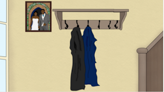
I edited the original picture to make it look like Trayvon was carrying his wife. However the background was too small and did not look in proportion. Therefore I had to go back and change it, adding a few more details

I would like to add a voiceover to the beginning of my animation, whilst the titles are shown.This meant that I had to increase the duration  of the song that I already had placed on the timeline.


I edited the sound again so that it fit the piece. I had to edit out a bit in the song when someone swears rather abruptly (I don't think this would go with the tone of the video at that point).


I added the FTT filter in order to create a muffled effect. This helped to transition betweeen where I had made cuts. It also helped the audio sound quieter so that it wouldn't be overbearing when I add a voiceover.


Finally here is the second draft of my animation. I'd say it's about 90% done right now. I still have to create the visuals for the title within the first 10 seconds and add a voiceover. From the last draft I've worked hard to make more things animated, especially making sure the characters blink. I might change the way the title '2012' appears as it looks a bit amateur. Also I think I should increase the speed that Trayvon walks. I also need to add some more sound effects to the second half of the scene so that it's not just the soundtrack.

Saturday, 12 December 2015

Week 12 Development 2


I worked on creating the new scenes for the beginning. I drew out Trayvon sat on a bus.


I created the background on a separate document to make it look like the bus was moving forward. I also tried a new technique when making the characters blink.

Thursday, 10 December 2015

Week 12 Development

Improved walk cycle
I tried to improve the walk cycle with help from Paul. I followed Eadweard Muybridge's technique:


I used moved the parts of my character's legs to fit the motion that Muybridge had displayed. This created a more accurate appearance of movement.


I then used Photoshop to layer each of the frames.


When pieced together it created the illusion of walking movement.


Wednesday, 9 December 2015

Alternating Storyboard

I decided to reorder some parts of my storyboard.
Following the feedback I'd got from the mid-term assessment and from talking to my tutors I've decided to cut the ending of my sequence, and finish the video after Trayvon gets shot. This would give me more time to work on the rest of my frames. I didn't think my ending was a very solid idea anyway.
Instead I will create a longer introduction. Paul suggested that I should show the young version of Trayvon at the beginning. This would make the audience aware of his character initially and so they will recognise him when he appears again in the second half of the video. I sketched out (roughly) what I'd like this scene to look like below:


I also decided to add a shot of Trayvon and his love interest as they go on a date. This is so it doesn't look random when they appear to be married. I will show Trayvon giving his wife a rose and then the pair will sit down at a restaurant. Shown very roughly below:


Also, I want to alter the image I used in the mid-term assessment of Trayvon graduating so that there is more movement. I will add some more characters to create more of a communal celebratory atmosphere. I decided to change this because thought that Trayvon and the girl looked too isolated in the scene. Sketch below:


Friday, 4 December 2015

Week 11 Development

Walk Cycle Trial:


I tried to follow the tutorial that was given in 'The Animator's Survival Kit' by Richard Williams.


I used illustrator to position the characters legs in a similar way to each of the frames shown in the image.

I think the effect looked quite weird when put together, so I'll have to improve this.

Development screenshots:

The character appeared to be really pixelated against the background. I think I will correct the PSD image so that the file size is larger and sharper.


I used three different layers here so that I could create depth of field. This will emphasise Trayvon's fear as he will only be focused on the gun pointing at him.

Adding Textures:


Mary suggested that I add textures to settings to make them look more impressive. In the image above I used an old paper texture, however I don't think it looks very good. Instead it just makes the scene look dirty.


Here I used a wall texture which I think works much better as it isn't so obvious.


I experimented with using on of my old images to make it look like it was night time.


 Making Characters blink


I've began making my characters blink so they don't look like such flat images. I don't think the effect looks very good, as you can see the transition between the opacity